Saturday, August 1, 2009

30 - Continuously variable proportional circle map


This continuous variable proportional circle map was located at: http://geographyfieldwork.com/DataPresentationMappingTechniques.htm. This type of map shows the relative sizes of some for some variable.

31 - Range Graded Proportional Circle Map


This range graded proportional circle map was found at: http://gsc.nrcan.gc.ca/mindep/synth_dep/sedex/images/fig17.jpg. It depicts proportional circles whose sizes represent a range of data.

32 - Classed Choropleth Maps


This classed choropleth map was found at: https://www.e-education.psu.edu/files/geog860/image/citationexample.jpg. A classed choropleth map is a thematic map that uses shading used to represent some class attribute value.

33 - Unclassed Choropleth Map


An unclassed Choropleth map does not have any classes identified. A map example that depicts this is located at: http://www.math.yorku.ca/SCS/Gallery/milestone/sec5.html.

34 - Bivariate Choropleth Maps


This bivariate Choropleth map was found at: https://blogger.googleusercontent.com/img/b/R29vZ2xl/AVvXsEhKKODN2O_-3grLD7G94mkHOrFblHANPN-GqLkguSofk6vdYqbIdhb2CO4oMXtiPS87AedyqXwTMEjSXpXNgqm_md-_t8WhWa9EYBkTdK8hFzidzmJq6opELMI0VpcEhYqNPpsPx1sZzzc/s400/Income+Distribution+By+Race.gif Bivariate choropleth maps show data for two variables. For example, this could be the population by race, or gender in the U.S.

35 - Unvariate Choropleth Map


This Unvariate Choropleth map was found at: http://www.mint.com/blog/wp-content/uploads/2009/04/mint-income-r3.png


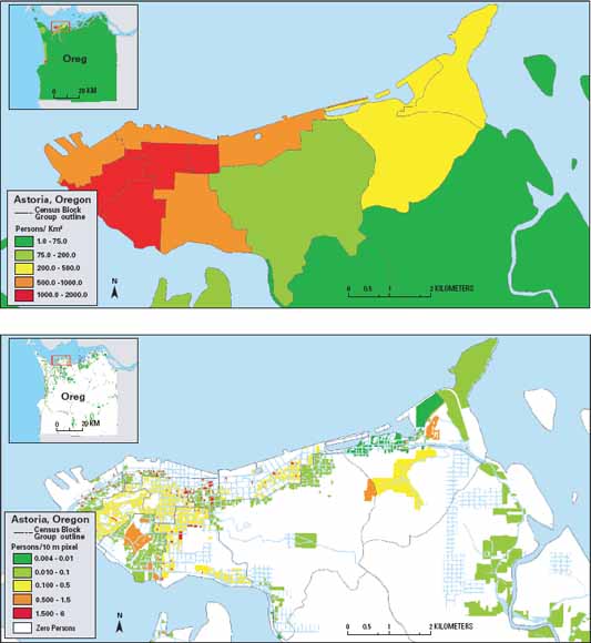
Unvirate choropleth maps are useful in showing data for a single variable. This could be the percentage of population that are getting the swine flu, or that make more than $50K per year. It would not show multiple variables data.

36 - Standardized Choropleth Maps


This standardized choropleth map was found at: http://pubs.usgs.gov/tm/tm11c2/images/coverphoto.jpg. These maps show data that has been standardized showing not raw numbers but statistical averages or percentages.

37 - Unstandardized Choropleth maps


This Unstandardized Choropleth Map was found at: https://courseware.e-education.psu.edu/courses/geog484/L06_cg.html. Unstandardized choropleth are thematic maps using shading or patterns, but this case uses raw numbers, and not averges or percentages.

38 - Nominal Aea Choropleth Maps


This Nominal Area Choropleth Map was found on https://courseware.e-education.psu.edu/courses/geog482/policies.shtml. It represents minority groups with the highest percentage of the population.

46 - Triangular Plot


This triangular plot was found at: http://en.wikipedia.org/wiki/Triangle_diagram. A Triangular Plot plots data for three variables which sum to a constant, such as clay, sand, and loose soil. The three variables make up 100% composition of a certain area

47 - Parallel Coordinate Graph


This is a Parallel Coordinate Graph (PCG). This one was found at: http://gis.cancer.gov/nci/geovisualization.html. A parallel coordinate graph allows you to map a data dimension or field to a vertical axis. Each line represents a single event.

51 - Similarity Matrix


A similarity matrix depicts a close relationship of similarities between two data points. This one was found at: http://images.google.com/imgres?imgurl=http://www.protonet.cs.huji.ac.il/images/gd_clust_dist2.gif&imgrefurl=http://www.protonet.cs.huji.ac.il/guided_tour.php&usg=__FENk_G7gZIiU16Nn-qrn2GghoJY=&h=636&w=462&sz=24&hl=en&start=22&um=1&tbnid=dcZESXTBDGhIJM:&tbnh=137&tbnw=100&prev=/images%3Fq%3Dsimilarity%2Bmatrix%26ndsp%3D21%26hl%3Den%26rlz%3D1T4ADBF_enUS315US316%26sa%3DN%26start%3D21%26um%3D1.

52 - Correlation Matrix


This correlation matrix was found at: http://www.kltprc.net/policynotes/Gifs/Tab_005A_4.htm. A correlation matrix shows the direction and strength of a relationship between 2 variables. This could be used to depict values on in a geographic area such as race and income, or education level.

53 - Star Plot - Spider Plot


This star plot was found at: http://www.answers.com/topic/spider-plot, and depicts data visually using a range of criterial on lines on the outside of the circle with a range (e.g. 0-5) from the center of the circle outward. Then lines are drawn connecting individual point values for each criteria giving the plotted values a starlike appearance.

29- DOQQ


DOQQ stands for Digital Orthophoto Quarter Quadrangle, and this map was pulled from: http://www.directionsmag.com/features.php?feature_id=113. It is a color arial image of a geographic area.

28 - DEM - Digital Elevation Map


This DEM map was found at http://en.wikipedia.org/wiki/File:Oregon_DEM_relief_map.gif. It is a digital elevation map, and shows terrain elevations at regularly spaced intervals. Some of these that are created by the USGS vary in terms of different factors such as: coverage area, accuracy, sampling intervals, etc.

26 - DRG (Digital Raster Graphics)


DRG Stands for Digital Raster Graphics and it is a digital map image that shows topographic imagery of a given geographic area. This map was found at: http://www.sdc.ucsb.edu/holdings/collectionpage/DataExamples20000516.htm.

25 - Isopleth map


This isoplath map was found at: http://www.answers.com/topic/contour-line It is useful in mapping surface elevations, or rainfall amounts, atmospheric pressure and other variables.

23 - Isohyets Map


This is an isohyet map located at: http://pubs.usgs.gov/of/1997/438/97-438.html . An Isohyet has lines drawn on a map that connect points of equal rainfall.

22 - Isotach Map


This isotach map was found at http://weather.cod.edu/help/700help.html. An isotach map is a map that connects points on a map with lines that represent the same wind speed.

21 - Isobar Map


This isobar map was taken from http://www.crh.noaa.gov/unr/?n=05-06-99, and shows lines that connect points of equal atmospheric pressure.

20- LIDAR


This LIDAR (Light Detection and Ranging) map was taken from http://www.loc.gov/exhibits/911/911-object.html. LIDAR is one of the remote sensing technologies that detects and measures scattered light to determine range of a target, or provide visual imagery of some geographic area.

40- Lorenz Curve


This Lorenz Curve graph was taken from: http://www.sarpn.org.za/documents/d0000990/. It depicts income on the x-axis and households no the Y-axis. The Lorenz curve depicts income inequality amongst households.

41 - Index Value Plot


This index value plot was taken from: http://waterwatch.usgs.gov/?m=pa07d&w=plot&r=nm.

It shows average streamflow amounts over a period of time using an x and y axis, and plotted values.

16-Cartographic Animation


This cartographic animation was taken from: http://video.google.com/videosearch?sourceid=navclient&rlz=1T4ADBF_enUS315US316&q=cartographic%20animation&um=1&hl=en&ie=UTF-8&sa=N&tab=iv&start=0#q=cartographic+weather+animation&hl=en&emb=0. This is an image, but the link is to the page that has the cartographic animation on it. This animation shows a weather forecast, key attributes such as cloud cover, temperature and other things over a digital map.

15-Statistical Map


This is a statistical map from http://www.denvergov.org/2001_crime_stats/AllOtherCrimes/AllOtherCrimes2/tabid/377596/Default.aspx. Statistical maps apply statistical data values and visualization technique to depict something like crime statistics.

14-Cartogram


This is a cartogram map. It was taken from: http://www.kieranhealy.org/blog/archives/2004/11/04/red-counties-blue-counties-and-occupied-counties/. Cartograms is a map that takes some thematic aspect, such as electoral votes (this example), or GNP, or some other value, and maps them over a geographic area.

13-Flow Map


This flow map was taken from: http://your.kingcounty.gov/airport/pilots/fly_quiet.stm. A flow map is an excellent visualization that shows the flow of some data graphically depicted. This could be a map to show the spread of the west nile virus, or flight patterns in this case.

12 - Isoline Maps


This isoline map was found at: http://www.tutorialsolutions.com/esLandforms.htm. Isolines are used to connect points on a map that have the same value. This could be temperature, wind speed, etc.

11-Proportional Circle Maps


This proportional circle map is from: http://www.neiu.edu/~ejhowens/377/examples.htm. These visualizations can show a particular attribute’s value. The larger the circle, the larger the value, and vica-versa. In this example, the size of the circle’s show the size of a particular race’s population values

10-Choropleth Map


This is a Choropleth map from: http://www.es.mq.edu.au/courses/GEOS219/choropleth.htm. Choropleth maps are thematic maps that use techniques such as shading or patterns that reflect various data measurements (e.g. income, causes of death.

9-Dot Distribution Map


This dot distribution map was located at: http://operationmilitarykids.ohio4h.org/resources/bycounty.html. This type of map shows the distribution of military families in the state of Ohio. These types of maps are useful for plotting any type of information. This has been used to show locations of public offenders, as well as population distributions in larger maps, like the U.S.

8-Propaganda map


This propaganda map came from http://www.alternatehistory.com/Discussion/showthread.php?t=76102. They use maps to depict social, economic, or political information to influence those who view the map.

7 - Hypsometric Map


This hypsometric map shows elevation progressions using contours, shading, and other techniques within a specific geographic area. This map was found on: http://mappery.com/map-name/Downtown-Keene-tourist-map

6-PLSS Maps


This PLSS map came from: http://www.fgdc.gov/library/whitepapers-reports/annual%20reports/2008/web-version/AppendixC.html. PLSS stands for Public Land Survey System, and is used to subdivide and describe land in an area. This map is a typical PLSS map of the United States.

5-Cadastral Map


This Cadastral map was found on: http://www.icsm.gov.au/mapping/maps_cadastral.html. Cadastral maps are useful for showing land boundaries or land parcels, and who owns it.


The following topographic map was noticed on: http://geology.isu.edu/geostac/Field_Exercise/wildfire/topography.htm

This type of map shows geographic features of an area, and shows contour lines that indicate terain direction, the rise and fall of the terrain, how gradual or severe the slope is, and other features.

2-Planimetric Map


A planimetric map depicts boundary longitude, latitude, water sources, land-use, and other features. These are sometimes used for things like highway maps. The planimetric map shows came from: http://geography.unco.edu/jdoerner/GEOG274/map.htm.

43 - Population Profile


This is the a world population profile that shows the age, gender, distribution, and number of people in the World Population. This kind of graph is quite useful, and as you can see shows impacts of one elements, AIDS, on the world's population. This map came from: http://www.fao.org/docrep/005/y8331e/y8331e05.htm

50-Stem and Leaf Plot


A stem and leaf plot is a type of visualization that depicts the distribution of a dataset and shows the individual values. The values on the left are called the stem and the data on the right are called the steam. This type of graph is good for organizing large amounts of data. This plot was found on: http://www.learner.org/courses/learningmath/data/session3/part_h/homework.html

49-Box Plot Diagram


The boxplot diagram is a good map to show differences in data groupings, like in this case subjects, or in other cases, population. In some diagrams, spacing between the parts of the box show skew and spread of data, and can show the exceptions. This box plot digram was found on: http://www.xfy.com/manual/dev/developer/1.4/spec/spec_chart.html